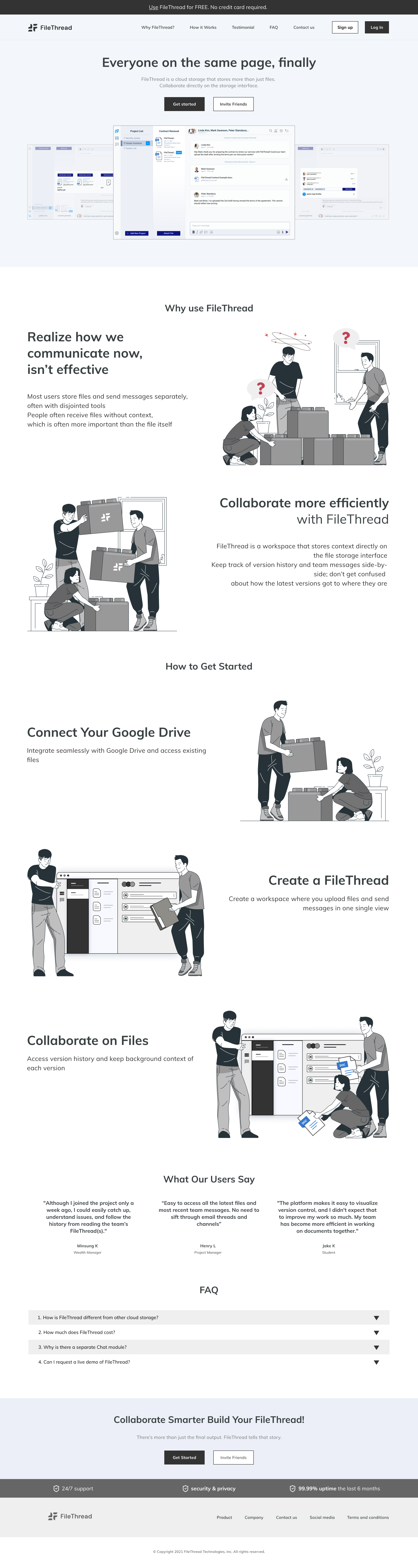
Overview
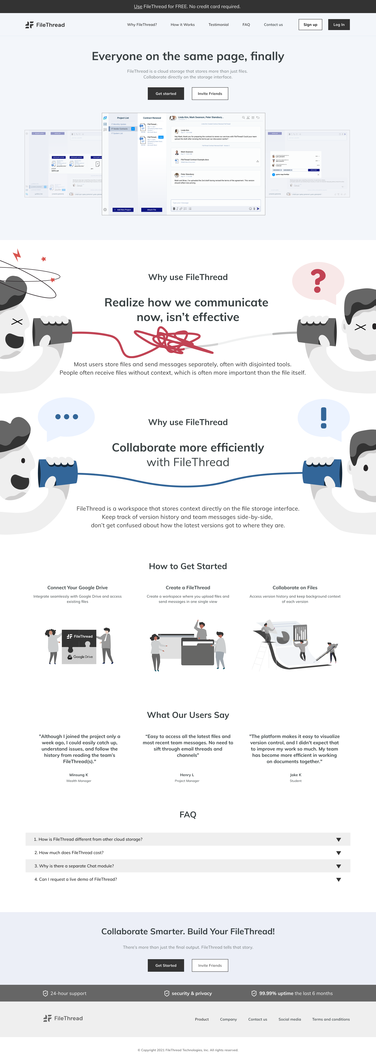
This project involved a comprehensive redesign and platform migration (from Wix to Webflow) to resolve the technical constraints and UX limitations of the legacy website. To address poor readability and mobile incompatibility, I implemented a fully responsive, wide-screen layout replacing the restrictive 1024px width. By shifting from a text-heavy interface to a visual-first strategy utilizing videos and imagery, I significantly enhanced user engagement. Furthermore, I repaired critical conversion paths—such as the non-functional contact form—transforming the site into a reliable business asset.
Discover
After joining FileThread as a designer, I reviewed the existing website and identified several issues affecting user experience and communication:
- Limited screen width (1024px) reducing readability
- Excessive text content making information hard to scan
- Small screenshots that failed to showcase the service clearly
- Non-functional “Contact Us” form causing friction
- No mobile optimization, leading to poor usability on devices
- Technical constraints and bugs from the Wix platform
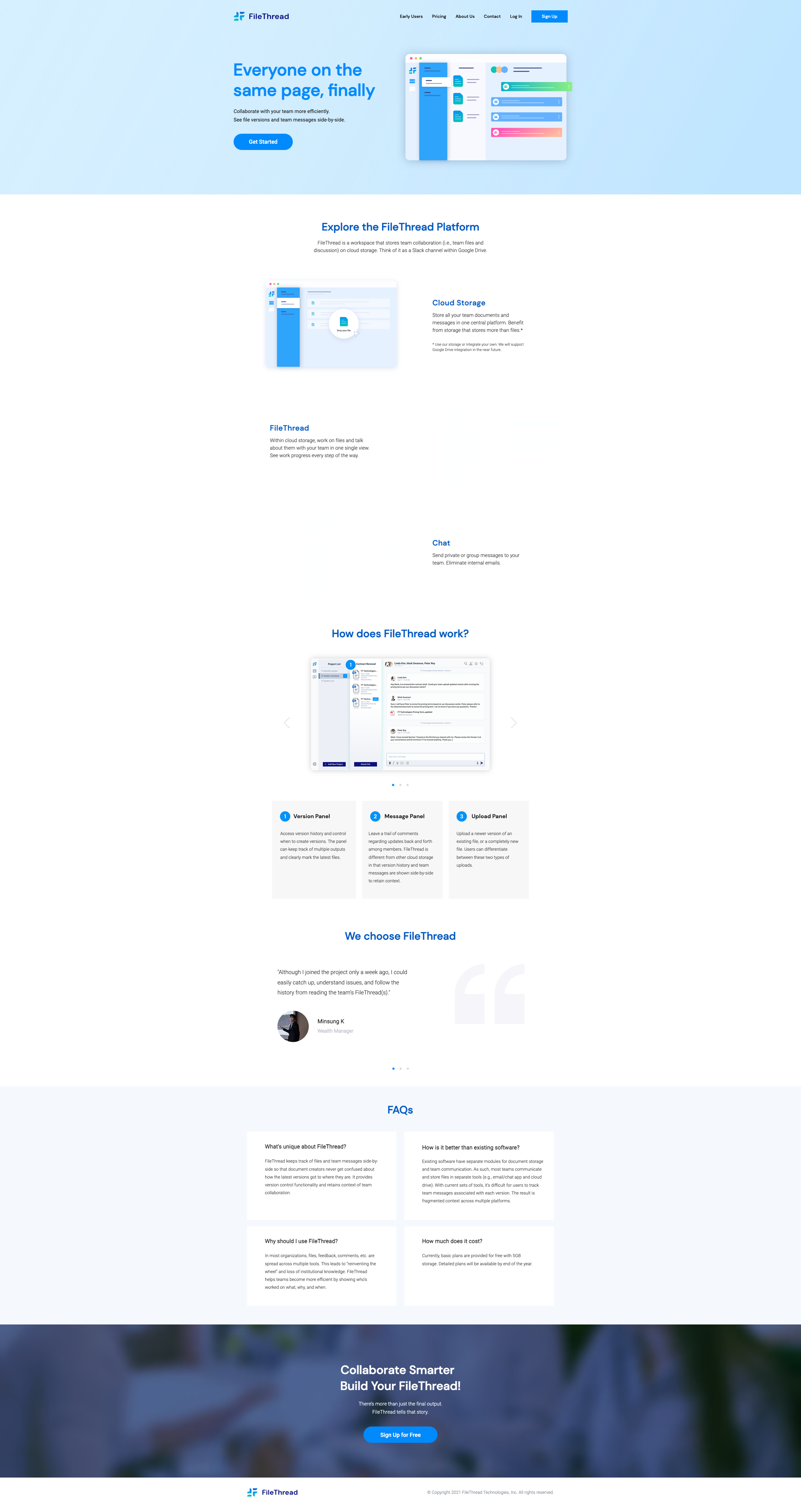
Previous website
Define
After reviewing the issues, we discussed the key points and agreed to redesign the website with the following improvements:
- Use a wider container width than the current website
- Replace text-heavy content with more videos and images
- Apply stronger visual hierarchy through size and color contrast
- Fix the “Contact Us” form-mail to ensure proper functionality
- Implement a fully responsive layout for mobile browsing
- Migrate the website platform from Wix to Webflow
During the discussion, I also created rough hand sketches to capture and organize our ideas.
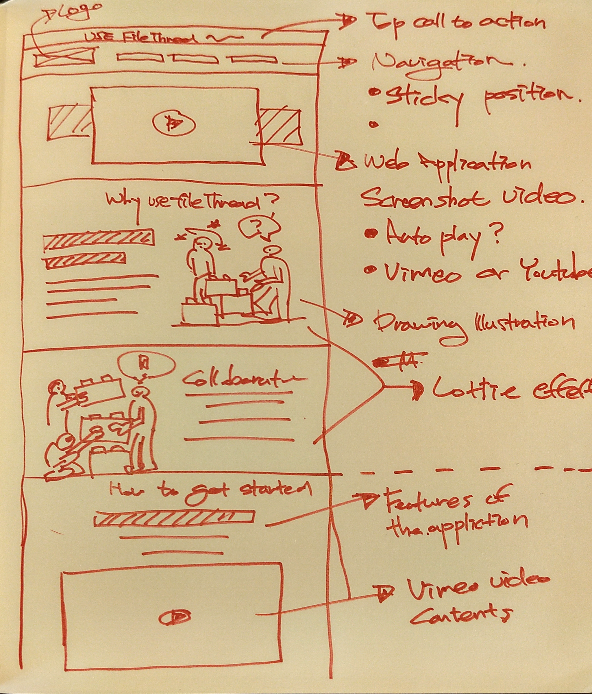
A rough sketch, we had a discussion from this
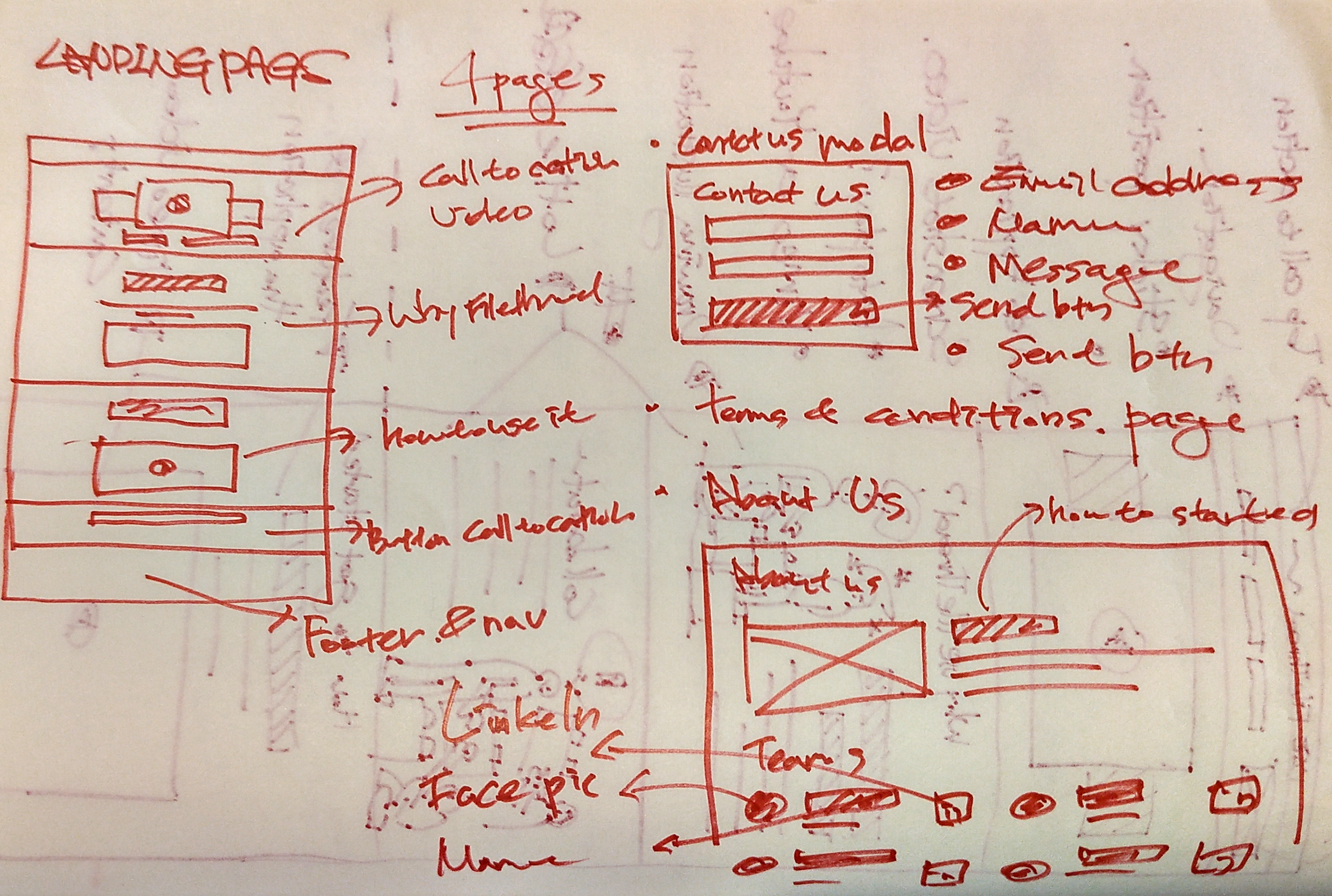
A rough sketch, we had a discussion on conversions from this
Design
Type A
Type B
