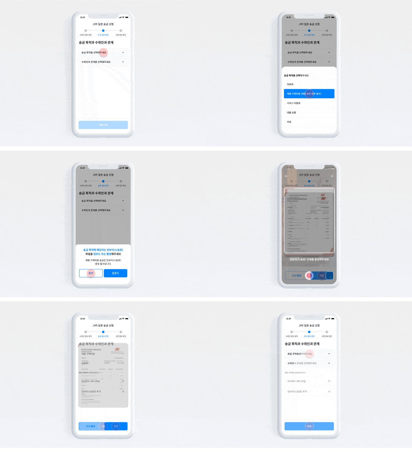
- We identified a 52% attrition rate at a key step in our remittance process and hypothesized that this was due to a confusing, non-linear flow. To solve this, we restructured the application into two distinct stages: a Customer Verification (KYC) flow for fixed, sensitive information and a Remittance Application flow for variable, transaction-specific details.
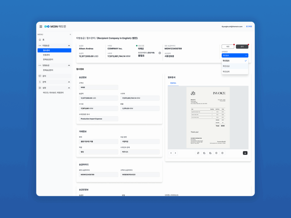
- 해외 송금 · 지급결제 서비스 플랫폼 제품을 기획하고 디자인하였습니다. 개인 또는 기업이 국경을 넘는 거래를 안전하고 효율적으로 수행할 수 있도록 지원하는 디지털 기반의 금융 서비스 인프라로 해당 시스템은 거래 요청, 수취, 실명 인증, 거래 상태 추적, 파트너 연계, 정산 및 보고 기능을 통합적으로 제공하는 종단 간(End-to-End) 송금 · 지급결제 거래 관리 플랫폼입니다. 영국 소재 글로벌 핀테크 기업 W사의 타발송금 거래를 해당 플랫폼을 통해 운영 예정입니다.
- Following a partner’s policy change request, the introduction of complex and variable fees made MOIN’s pricing structure difficult to understand, reducing user trust and resulting in a 44% decline in existing user transactions. By simplifying the fee and exchange rate structure and introducing a clear comparison feature, we improved transparency and restored trust — increasing conversion by 21% among existing users.
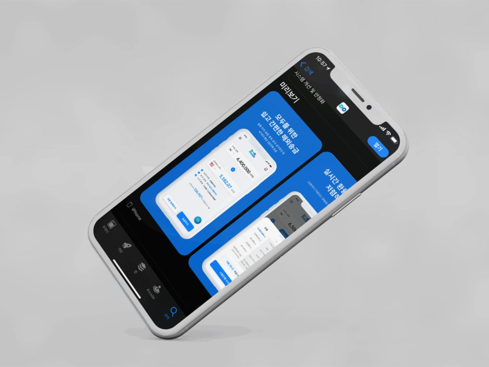
- App Store screenshots are the first touchpoint where potential users encounter the service. The goal of this project was not just aesthetic improvement, but to optimize ASO (App Store Optimization). By intuitively visualizing MOIN’s core value propositions—Speed, Low Fees, and Convenience—I aimed to reduce hesitation and increase the Store-to-Download Conversion Rate (CVR)
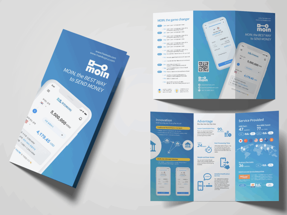
- As a digital-first fintech service, Moin lacks a physical presence. In offline settings like study abroad fairs or partner banks, we needed a tangible touchpoint to build trust. However, traditional financial leaflets are often cluttered with jargon and text, leading to low engagement. Our challenge was to design a leaflet that is not only visually appealing but also compels the user to open the app immediately.
- This project involved a comprehensive redesign and platform migration (from Wix to Webflow) to resolve the technical constraints and UX limitations of the legacy website. To address poor readability and mobile incompatibility, I implemented a fully responsive, wide-screen layout replacing the restrictive 1024px width. By shifting from a text-heavy interface to a visual-first strategy utilizing videos and imagery, I significantly enhanced user engagement. Furthermore, I repaired critical conversion paths—such as the non-functional contact form—transforming the site into a reliable business asset.
- Tkita is a communication service platform developed by AirSound. This project was a high-priority brand identity initiative undertaken to rescue a stalled design process from a previous agency. With a critically tight deadline of just two weeks and limited initial briefs, I analyzed the core functionality of the demo service to establish a visual concept from scratch. I developed a friendly and intuitive logo system combining speech bubbles with facial expressions to visualize 'conversation' and 'connection.' Despite the time constraints, I successfully delivered a comprehensive brand identity and guideline, enabling the client to launch their service on schedule.
- The goal was to establish a digital presence that adheres to Eucerin's strict global brand guidelines while optimizing for the specific behaviors of Korean consumers. We aimed to build a trusted D2C channel that connects brand awareness directly to sales conversion.
- Design logic is often abstract and hard to communicate verbally. We needed a visual medium to bridge the gap between our internal logic and client understanding. By combining Grid Theory and Motion Design, we developed a visual manifesto that clearly articulates our systematic approach to problem-solving.
