Overview
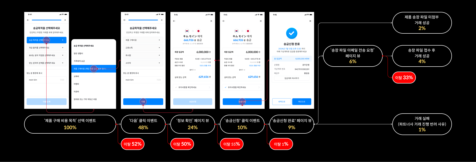
We identified a 52% attrition rate at a key step in our remittance process and hypothesized that this was due to a confusing, non-linear flow. To solve this, we restructured the application into two distinct stages: a Customer Verification (KYC) flow for fixed, sensitive information and a Remittance Application flow for variable, transaction-specific details.
This clear separation reduced user friction, resulting in significant conversion rate increases of 21 percentage points for existing users and 15 percentage points for new users. The positive outcomes validated our approach, highlighting that improved user experience can successfully overcome the friction of an added verification step.
Discover
Problem
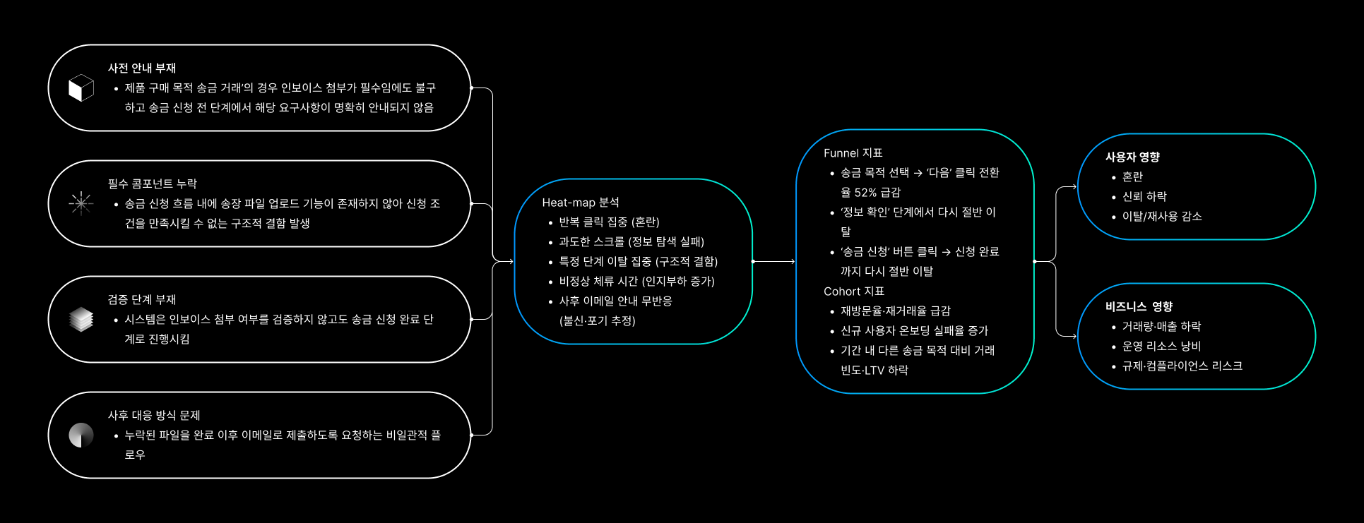
In the JPY remittance application process, the 'Please select the purpose of remittance' step has an attrition rate of approximately 52%. When 'purchase of goods' is selected as the remittance purpose, users are required to attach the invoice issued for the goods without prior notice.
Although the file upload component was not appearing, users were still able to proceed, but the attrition rate remained high due to this confusing experience.
Consumption
- By providing advance notice of required documents and displaying the user's progress, we could reduce the cognitive load and decrease the attrition rate.
AS-IS
Define
The goal
Reduce the user attrition rate at the 'Please select the purpose of remittance' step from approximately 52% to a measurable, acceptable level which would be less than 42% for existing users.
Solution
I separated the customer verification (KYC) flow and the remittance application flow.
- Customer Verification (KYC) Flow: This initial stage focuses on collecting fixed, sensitive information such as 'Occupation' and 'Source of Funds.' By gathering this static information upfront, we streamline the subsequent remittance application process.
- Remittance Application Flow: This stage is dedicated to collecting variable information specific to each transaction, such as 'Purpose of Remittance' and 'Relationship with Recipient.' This separation minimizes friction and allows users to complete the core remittance task more efficiently.
Design
Customer Verification (KYC) Flow
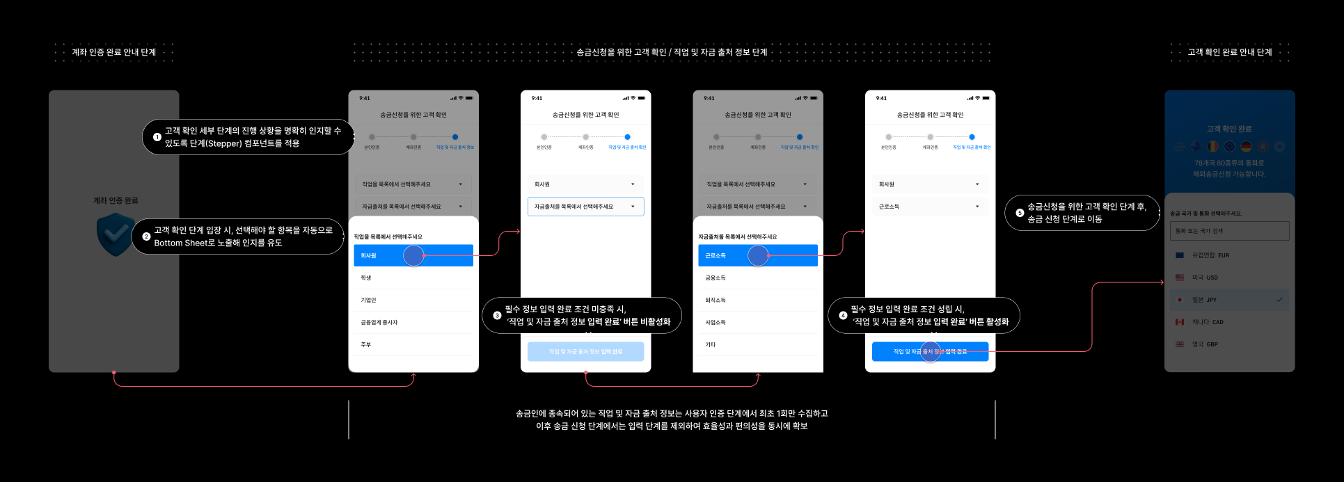
To streamline the remittance process, I redesigned the verification flow to collect static user data—such as occupation and source of funds—only once during the initial authentication phase. By removing these repetitive steps from subsequent transactions, we significantly improved both operational efficiency and user convenience.
Customer Verification (KYC) Flow
Remittance Application Flow
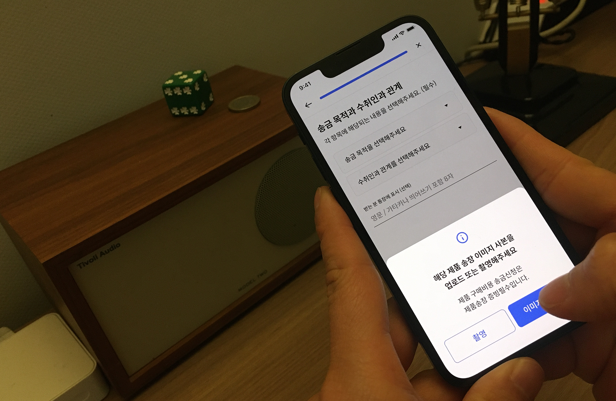
To reduce user drop-off rates during JPY product purchase remittances, I redesigned the flow to provide clear predictability. The system now notifies users of the mandatory invoice requirement upfront and guides them seamlessly through a dedicated capture/upload process without leaving the app.

Remittance Application Flow
Outcome
We conducted an A/B test to obtain quantitative metrics. The results showed a significant increase in the remittance application completion conversion rate for both existing and new users.
| User type | Conversion rate from the previous user interface | Conversion rate from the improved user interface | Result |
|---|---|---|---|
| Exsisting user (Membership for more than a year, more than 6 transaction done) | Original UI: ~48% | Improved UI: ~69% | Result: a 21% increase |
| New user (Membership less than two months, Only first time transaction done) | Original UI: ~37% | mproved UI: ~52% | Result: a 15% increase |
Retrospective
The conversion rate results were higher than anticipated. This led us to conclude that a more thorough verification process was needed, rather than simply celebrating the positive signal. The reason for this cautious approach was that we had expected the conversion rate to decrease, as we had added a step to the user verification process.
