We had a test with a prototype for foodIn.
After we worked out the high-fidelity user interface design, we had a test prototype made by Protopie. We went to EMART, And we had shopping as usual with the prototype. We measured how the user interface has usabilities. As we expected, there were a couple of issues that we ought to solve.
Issues from the prototype testing
Scan page
- The background colour weakness
- There is no choice in the case of an unavailable barcode scanning function.
- In the header, there is an un-necessaries back button. Due to no previous pages
- In the header, there is an un-necessaries back button. (unnecessary due to no previous pages)
- Hard to use for left-hand users. (this user interface seems to be designed for right-hand users)
- The user can not send this information to others
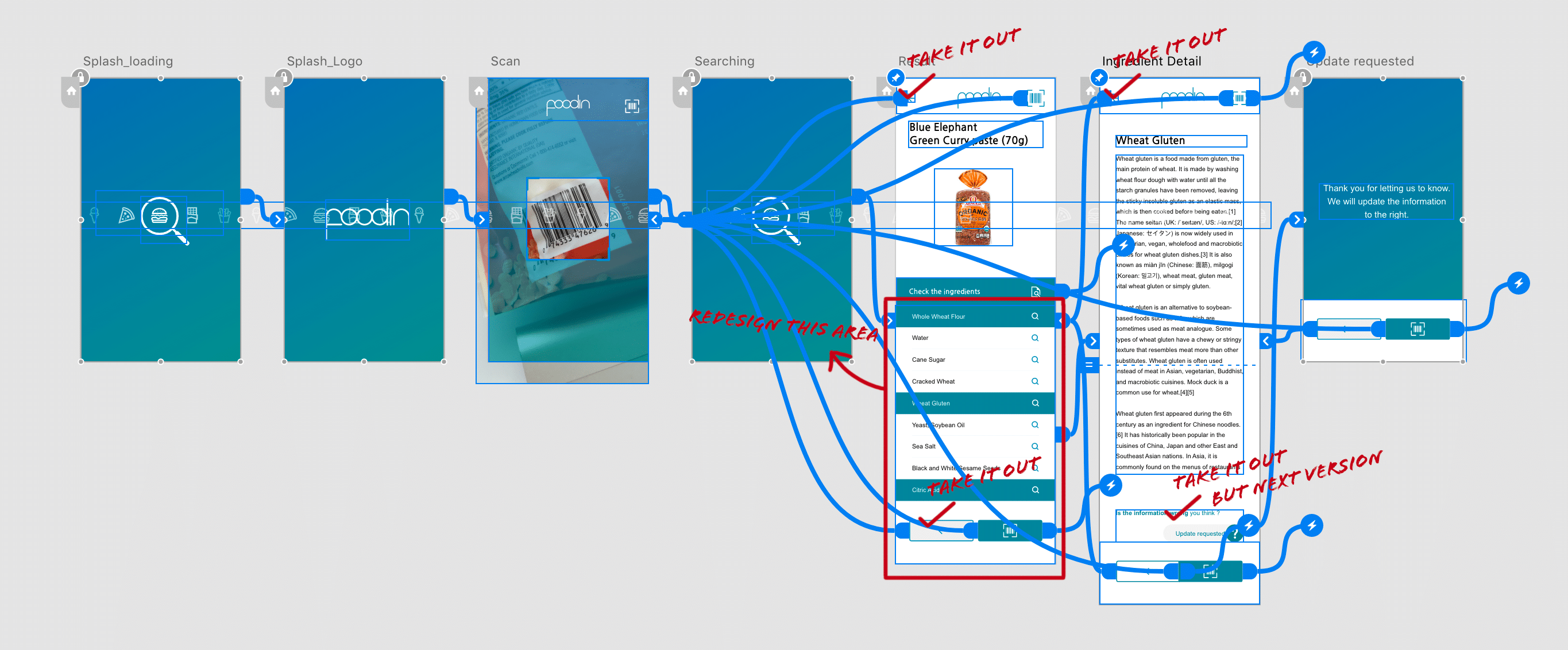
The updates we modified from the issues
Scan page
- Applying black transparency background for focusing the barcode
- Add a fill-in button that users can put barcode numbers directly in case of scanning is unavailable.
- In the header, the un-necessaries back button was removed
- Take back buttons(header and bottom) way. (unnecessary due to no previous pages)
- Re-arrange the transition between the result page and ingredient pages
- Adding a share button
- Adding Vegan label and Nutri-score label